Real Estate Thumbnail Concept
Real Estate Thumbnail Concept
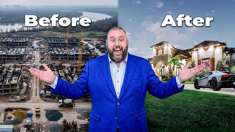
The Rise of Stone Creek Ranch — Luxury Real Estate Story
Thumbnail concept designed to highlight luxury real estate and celebrity property storytelling. The composition focuses on prestige, exclusivity, and curiosity to attract viewers interested in high-end real estate markets.
City Convenience or Country Space? Oro-Medonte Guide
Created to spark curiosity around lifestyle choices, using contrast between urban amenities and rural tranquility. The design targets homebuyers evaluating relocation options near Barrie and surrounding communities.
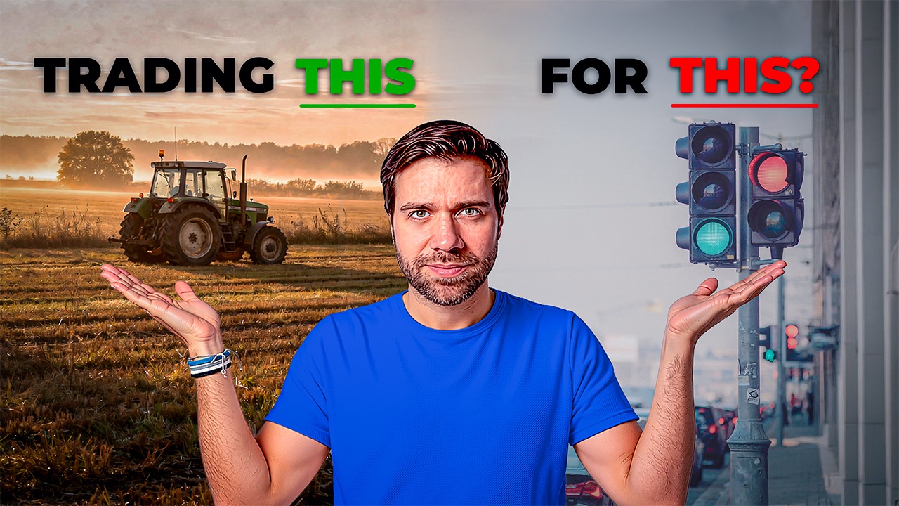
Portable Mortgages Explained — Smart Move or Risky Idea?
Created to spark debate around housing affordability and market policy changes, focusing on the trade-offs between flexibility and long-term financial risk for modern homebuyers.
Thumbnail Redesigns
Thumbnail Redesigns
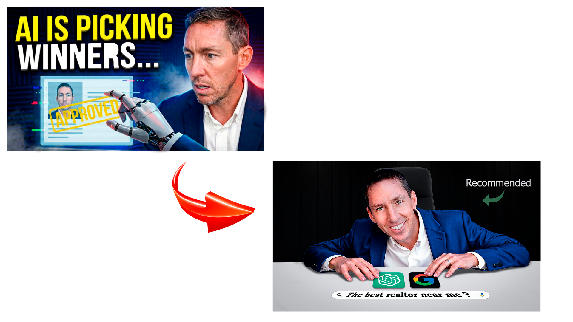
Thumbnail Redesign 01 — Real Estate Channel
The original prioritized aesthetic over clarity — the moody lighting, the robotic AI graphic, and the sideways glance at a floating screen created atmosphere without delivering a hook the target viewer could personally connect to.
The redesign corrects the strategic misalignment by anchoring the concept in a search bar every homeowner has used and a recommendation label that signals trust and social proof. The host's forward-leaning posture and direct eye contact replace tension with approachability — and in a niche built on personal relationships, approachability converts at a fundamentally higher rate than drama.
Thumbnail Redesign 01 — Real Estate Channel
Thumbnail Redesign 01 — Real Estate Channel
The original chose atmosphere over clarity. Moody lighting and a robotic graphic created tension with no hook.
The redesign anchors on familiarity — a search bar every homeowner recognizes, direct eye contact, and a trust label that converts. In a relationship-driven niche, approachability beats drama.
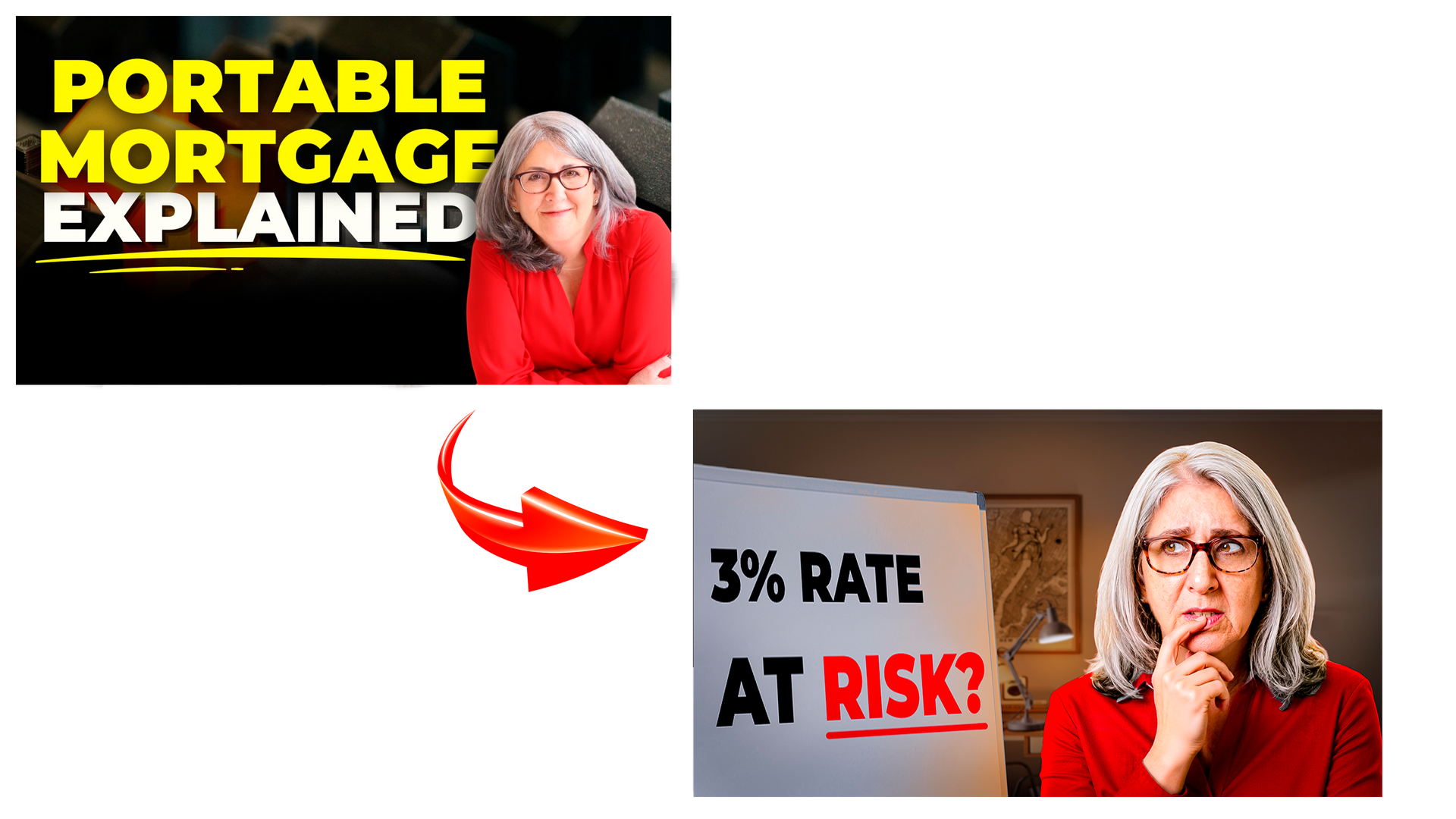
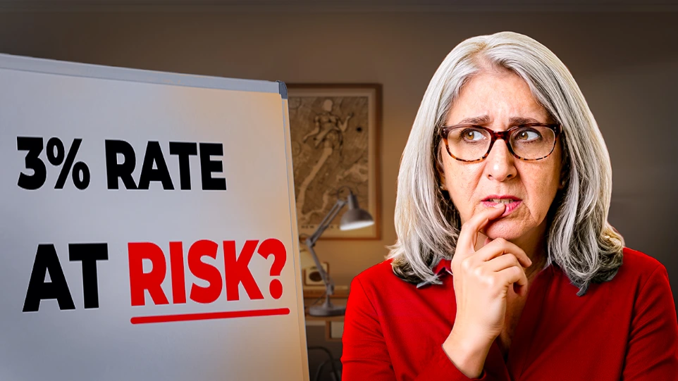
Thumbnail Redesign 02 — Real Estate Channel
The original lacked the visual hierarchy and emotional contrast needed to compete in a crowded feed — the subject blended into the background and the text carried the entire weight of the hook.
The redesign corrects both. Intentional lighting separates the subject as a clear foreground element, the bold composition guides the eye in the right sequence, and "3% RATE AT RISK?" delivers a curiosity gap that the original never achieves. Same creator, same topic — fundamentally different result.
Thumbnail Redesign 02 — Real Estate Channel
The original let the subject blend into the background, putting the entire weight of the hook on the text alone.
The redesign fixes the hierarchy. Intentional lighting isolates the subject, bold composition guides the eye, and "3% RATE AT RISK?" creates a curiosity gap the original never achieves. Same creator, same topic — fundamentally different result.
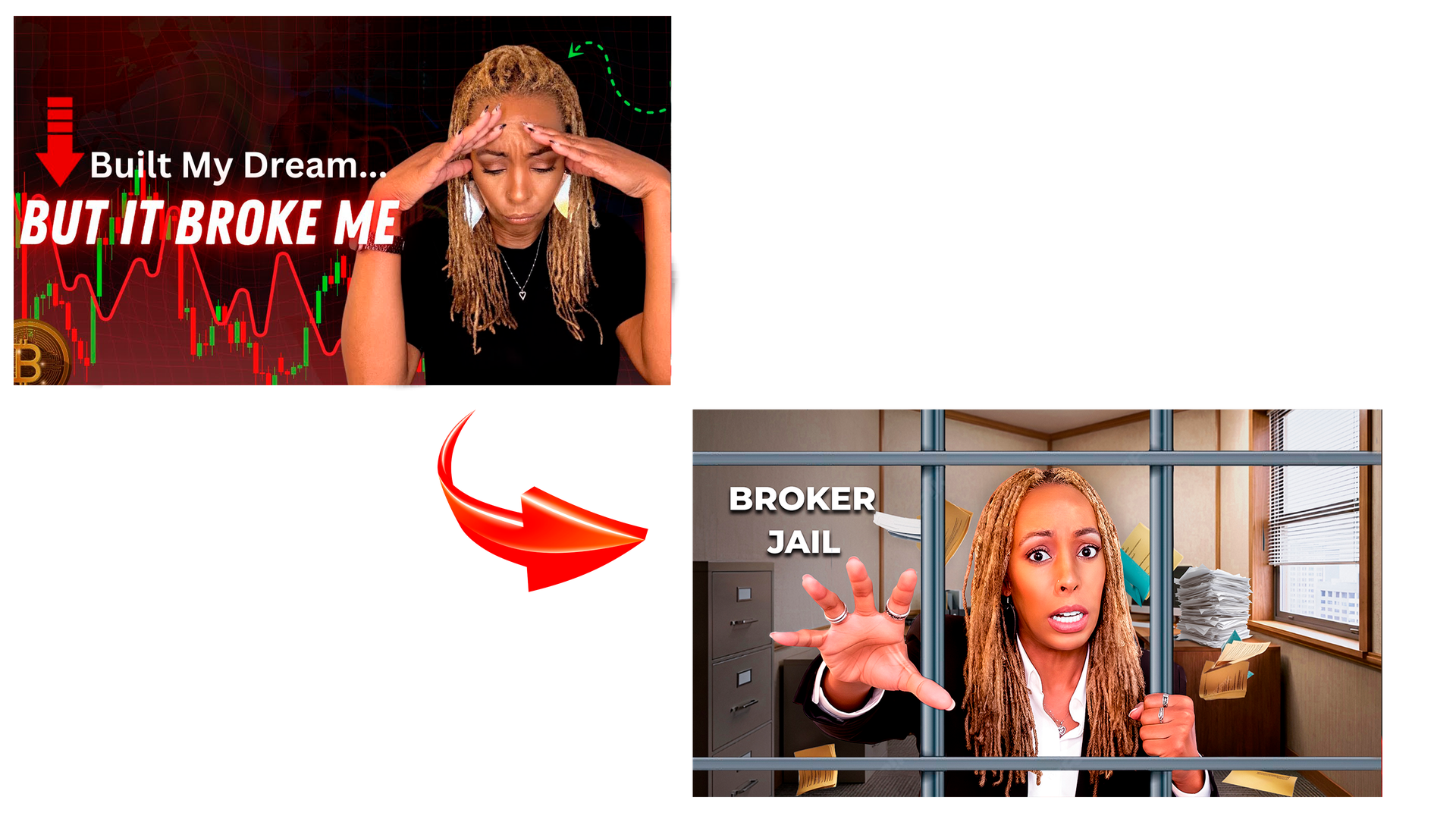
Thumbnail Redesign 03 — Real Estate Channel
Emotional thumbnails can generate sympathy without generating clicks, and that is precisely the trap the original fell into. The distressed expression and trading chart background signal a personal story, but personal stories in finance content attract viewers looking for relatability rather than viewers looking for answers — and those two audiences behave very differently once they arrive.
The redesign corrects the strategic positioning by replacing emotional vulnerability with dramatic consequence. Jail bars are a universal symbol of serious stakes, and placing them inside a professional office environment creates the kind of cognitive dissonance that stops a scroll instantly. The host's physicality reaching outward, wide-eyed, urgent transforms the composition from a static portrait into a scene mid-action. That single shift from emotion to drama is what separates a thumbnail people feel sorry about from one they feel compelled to click.
Thumbnail Redesign 03 — Real Estate Channel
The original generated sympathy. Sympathy doesn't convert.
The redesign replaces emotional vulnerability with dramatic consequence. Jail bars inside a professional office create instant cognitive dissonance — and the host reaching outward, wide-eyed, turns a static portrait into a scene mid-action. That's the difference between a thumbnail people feel for and one they have to click.
CLICKREAPER Cinematic YouTube thumbnail design for creators who are serious about growth.
Get In Touchhello@clickreaper.net Response within 24 hours
CLICKREAPER Cinematic YouTube thumbnail design for creators who are serious about growth.
Get In Touch With me on
© ClickReaper 2026 — All rights reserved. Designed for creators who mean it.